
It’s Global Accessibility Awareness Day today – and I really wanted to mark the occasion with something both inspiring and useful.
As luck would have it, I have just the person to help me sitting opposite my desk right now!
My wife, Fiona, is a graphic designer and branding strategist with nearly 2 decades of experience.
When it comes to designing websites, she’s not just dedicated to creating sites that are equal parts beautiful and functional – she’s an expert at making them accessible too.
Of course, if you’d like a brand new website, she’d love to help you out.
But if you already have a site you love and just want to make it more accessible, here are Fiona’s top 7 tips to do just that.
Take it away, Fiona…
7 easy(ish) tips to make your website more accessible.
As a web designer I look at a lot of websites, and one problem I see over and over is accessibility issues.
Partly down to businesses DIY-ing their sites and not knowing how to make them accessible (or not realising that they should!)
And partly, surprisingly, because accessibility isn’t on the radar of other professional designers. (I’ve been tasked with updating numerous websites designed by other pro designers and it’s wild how many would fail accessibility tests for things like colour contrast.)
The official stats support my own findings.
According to The WebAIM Million 2026 report, 95.9% of the homepages they tested failed accessibility tests.
So most of the internet is actually inaccessible, or difficult to use, for disabled people.
And that’s a significant number of people.
In the UK alone, about 1 in 7 people are neurodivergent – that’s about 10-13.5 million people. But the disabled community in the UK as a whole totals over 16 million.
That’s a lot of people…it’s also a lot of £££.
The Purple Pound -the spending power of UK households with at least 1 disabled person in them – is currently estimated to be worth £446 billion per year.
And if your competitor’s website is accessible while yours isn’t, you can guess who’ll be banking those Purple Pounds. (Hint: not you!)
So let’s look at ways to make your site accessible. Not just to boost your business, but to help make life easier for millions of people.
Admittedly, some aspects of making a site more accessible are best done by a designer or developer as they get a bit technical, but there are 7 things you can easily do yourself.
1. Colour contrast
Low contrast text is the most common accessibility issue found in the WebAIM Million report. And it’s a biggie, because if people can’t read your website, how can they buy from you?
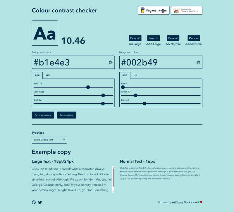
According to Web Content Accessibility Guidelines (WCAG) 2, your colour contrast ratio for normal text should be a minimum 4.5:1.
Even at that ratio, some combinations – like yellow and white, or a pastel colour palette – can be hard to read, so a higher ratio is better. That will make your text easy to read and your links and buttons easy to identify.
BUT, a word of caution. Higher contrast is not automatically better.
For example, pure white (#ffffff) with pure black (#000000) gives a contrast ratio of 21. Which sounds good. Except, contrast that high is actually quite harsh on the eyes, especially if there’s a lot to read. Your eyes will tire quickly.
So it’s better to soften one or both slightly, like an off-white with a very dark grey or navy.
If you want to check your colour contrast, there’s a really handy tool at https://colourcontrast.cc/
2. Missing alt text
Missing or ineffective alt text was another common error found in the report.
People who are blind, have low vision, or cognitive or learning disabilities, such as dyslexia, use screen readers to have websites read aloud to them.
But screen readers can’t read aloud the content of images unless you’ve added alt text to them, which means if the images on your site are missing the alt text, a significant number of people can’t understand them.
Alt text doesn’t need to be complicated.
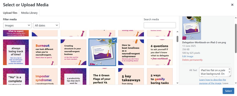
It’s best to keep it to a concise description of the image. Avoid using “photo of…” and things like that. For more help, the RNIB has a handy guide on writing alt text.
Most website builders and CMS tools make adding alt text really easy. For example, in WordPress, it’s right there in the upload screen.
But, not every image on your site needs alt text. If an image is purely decorative and doesn’t add information to the page, you can leave the alt text empty so that screen readers skip over it.
3. Headings
One thing that I see over and over when auditing websites, is people using heading tags in the wrong order. This not only affects the accessibility (screen readers use the html tags to interpret page structure and let users navigate the content) but also the SEO of your site.
The heading tags range from <h1> to <h6> and should be used in order.
Every page should have only one <h1> heading – usually the main heading on the page, which should be clear enough to tell people what the page is about.
Section headings are usually <h2>, and you can have multiple <h2> headings on a page.
Then subheadings within each section would be <h3>. Skipping over a level, for example to use <h4> under an <h2> instead of <h3> would show as an accessibility error.
Most website owners end up using the wrong level of heading because they’re using it to control text styles rather than to structure the page content. But you can create text styles (or get a designer, like me to help you!) in your theme so that you can have things looking the way you want to without messing up your heading levels.
4. Font sizes
This is a super quick one: making sure your text is big enough to be read easily.
For body text (that’s your paragraphs rather than your headings), a minimum of 16-18px is recommended to make your content easy to read.
Designery side note: when checking the font sizes in your site settings, you might see them set as rem sizes rather than px. Rem is a relative unit, while px is a fixed size, so using rem values makes your site even better for accessibility.
Simply speaking, rem values are measured relative to the base size – your body text – so if the base style has been set to 16px, then 1rem will equal that.
Using rem makes your site easier to scale if users need to adjust the zoom on their browsers.
5. Font choices
Your font choice can affect the legibility of your content.
For example, script fonts and decorative (display) styles are harder to read so should be used sparingly, and never for paragraph text. They work great in small amounts for short headings, or as an accent font to add a bit more personality to your site.
Also, with script fonts, don’t use them in all caps, or adjust things like letter spacing as that makes them even harder to read.
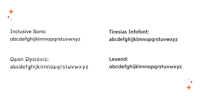
Some fonts have even been designed with accessibility in mind, to make it easier for folks with low vision or dyslexia to read.
6. Font styles
Never underline text on your website if you want to highlight it.
Underline, in the context of a website, makes text look like a link. So if people are hovering over underlined text, expecting a link, it looks like your site is broken. If you want to emphasise text, try bold or italics instead.
And when it comes to aligning your text, keep it simple.
Unless you are catering for an audience that reads right to left, for example if your site is in Arabic or Hebrew, aligning your text to the left is much easier to read.
Centred text is fine in small amounts, but if you centre large amounts of text, like paragraphs, it becomes harder to read.
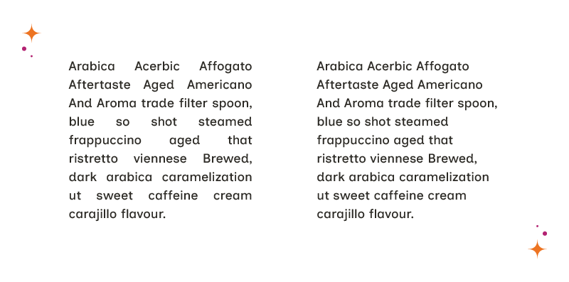
And never justify it! Justifying your text forces each line to fill up the horizontal space, and it can create really awkward spaces between words that make it hard to read.
7. Ambiguous & confusing links
Sometimes your language can create accessibility issues, especially when it comes to links.
When adding links to your site’s menu, try to resist getting creative with the names.
We expect to see familiar terms like ‘about’, and ‘contact’ in a site menu, so if yours reads ‘The Inside Scoop’, and ‘Holler’, you might confuse people. A bit of creativity can be fun, but don’t take it too far and end up with a menu that no one can understand.
Likewise, when adding links and buttons within your content, try to avoid using generic text like “click here”.
That doesn’t give any context to the destination, so people using screen readers and navigating by link can’t understand what the link is for or where it goes. Use something more descriptive instead, like “book a discovery call” or “download the guide”.
A little effort – and a few tweaks to your existing site – can make a world of difference to those with disabilities.
And if you’re still not sure where to start, or don’t have the time to make the changes yourself, I’d be happy to help. You can get in touch with me here.
